
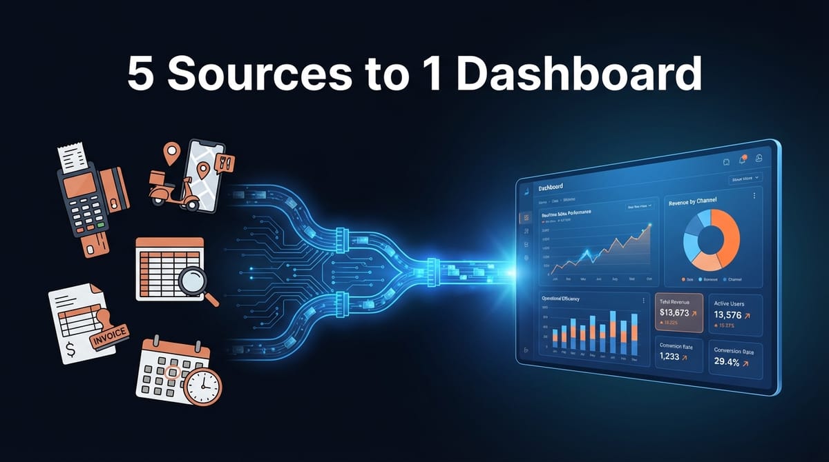
Restaurant Data Integration: From 5 Scattered Sources to One Real-Time Dashboard
The owner of a busy urban restaurant was spending Sunday mornings doing math instead of resting. Every week, the same ritual: export sales from the POS, download reports from three delivery platforms, cross-reference with the food cost spreadsheet, then manually calculate which dishes actually made money. By the time the numbers were ready, they were already a week old.
This is the story of how we turned that chaos into a single dashboard that updates itself.
The Problem: Data Everywhere, Insights Nowhere
When we first spoke with the client, they described their setup with visible frustration. Sales data lived in their point-of-sale system. Delivery orders came through Uber Eats, DoorDash, and a local platform—each with its own reporting format. Food costs were tracked in a Google Sheet that the kitchen manager updated (sometimes). Inventory counts happened on paper.
The result? Nobody knew the real margin on any dish until someone sat down for hours of manual reconciliation. And by then, the data was stale.
Here's what we mapped out:
- POS system: Transaction-level sales, but no integration with anything else
- 3 delivery platforms: Different commission structures, different report formats, different export schedules
- Google Sheets: Food costs updated weekly (on a good week)
- Paper inventory: Counted monthly, transcribed into another spreadsheet
- Time spent: 12-15 hours per week on data wrangling across the management team
The owner put it simply: "I know we're making money. I just don't know where—or how much we're leaving on the table."
The Solution: Automated Pipelines, One Source of Truth
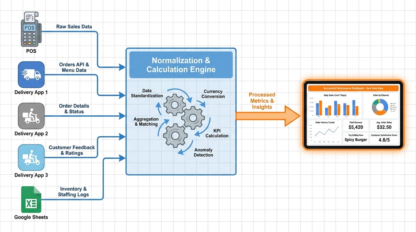
We built an integration system using n8n as the automation backbone. The goal wasn't to replace their existing tools—it was to make them talk to each other.
Data Collection Layer
First, we connected everything:
- POS API pulls hourly sales data, broken down by item, time, and payment method
- Delivery platform APIs fetch orders every 30 minutes, including commission fees and customer-paid prices
- Google Sheets integration reads food cost data whenever it's updated
- Manual inventory input through a simple form that feeds directly into the system
The tricky part wasn't the connections—it was normalization. Each delivery platform names the same dish differently. The POS uses internal codes. The food cost sheet uses whatever name the kitchen manager felt like typing that day.
We built a mapping layer that standardizes everything to a single menu taxonomy. Now "Margherita Pizza", "MARG-12", and "margherita 12 inch" all resolve to the same item.
Calculation Engine
Once the data flows in clean, the math happens automatically:
- True revenue per dish: Sale price minus platform commission minus payment processing fees
- Actual food cost: Based on current ingredient prices, not last month's estimates
- Contribution margin: What each dish actually adds to the bottom line
- Velocity metrics: How fast items sell, by day of week and time of day
We also built anomaly detection. If food costs spike 20% on a key ingredient, the system flags affected dishes. If a delivery platform suddenly shows zero orders, someone gets an alert instead of finding out a week later.
The Dashboard
The output is a real-time dashboard the owner checks on their phone. No spreadsheet exports, no manual calculations. Just answers:
- Which dishes made the most money this week (not revenue—profit)
- Which day-parts are underperforming
- Which delivery platform has the best margin after fees
- What the actual food cost percentage is right now, not last month
The dashboard updates every hour during service. By Monday morning, the week's performance is already summarized and waiting.
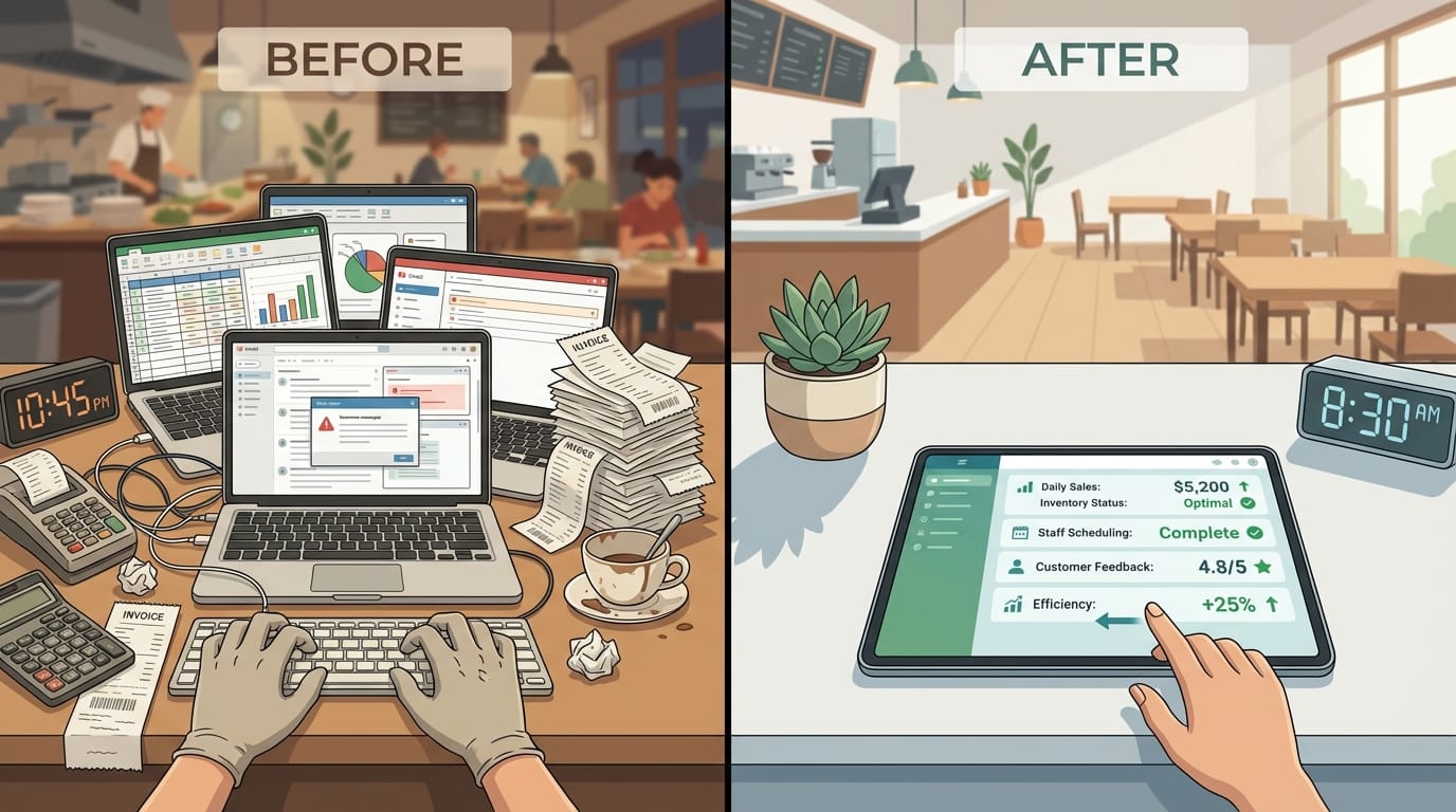
The Results: Time Back, Money Found
After two months of running the system, here's what changed:
Time saved: The 12-15 hours of weekly data work dropped to about 1 hour of reviewing dashboards and making decisions. That's 11+ hours back every week.
Menu pricing fixes: The data revealed three popular dishes were actually losing money after delivery commissions. Prices were adjusted within a week of going live. One dish was removed entirely—it was a crowd favorite that cost more to deliver than it earned.
Inventory waste reduction: With real-time velocity data, the kitchen started ordering based on actual sales patterns instead of gut feel. Food waste dropped noticeably within the first month. The owner estimated 8-10% reduction in spoilage.
Faster decisions: When a supplier raised prices mid-month, the owner saw the margin impact the same day and renegotiated within 48 hours. Previously, this would have shown up as a vague "costs seem high" feeling weeks later.
The ROI calculation was straightforward: the system paid for itself in the first month through the menu pricing corrections alone. Everything after that—time savings, waste reduction, faster reactions—was bonus.
Scaling to Multiple Locations
One thing we designed for from the start: this system works for chains, not just single locations.
The architecture separates data collection (per-location) from analysis (centralized). Adding a second restaurant means adding new data connections, not rebuilding the dashboard. Each location feeds into the same normalization layer, so cross-location comparisons work automatically.
For restaurant groups, this opens up questions that were previously impossible to answer quickly:
- Which location has the best margin on the same dish?
- Are food costs consistent across locations, or is someone overpaying?
- Which location should pilot a new menu item based on customer preferences?
We've seen similar setups scale to 15+ locations without major architectural changes. The bottleneck is usually getting API access from POS vendors, not the integration system itself.
What Made This Work
Looking back, a few decisions made the difference between a project that shipped and one that would have stalled:
Start with the questions, not the data. We didn't try to integrate everything. We asked: "What decisions do you make, and what data do you wish you had?" That kept scope tight.
Normalize early, normalize ruthlessly. The mapping layer took more time than we expected, but it's the reason the dashboard actually works. Garbage in, garbage out—we spent the time to prevent garbage from getting in.
Build for humans, not analysts. The owner isn't a data person. The dashboard shows answers, not charts that require interpretation. "This dish is losing money" beats "contribution margin trending negative."
Automate the boring parts, flag the interesting ones. The system doesn't make decisions—it surfaces the information that helps humans make better decisions faster.
If your restaurant (or restaurant group) is drowning in spreadsheets and delayed reports, this kind of integration is more accessible than it used to be. The tools exist. The APIs are there. It's mostly a matter of connecting them thoughtfully.
At Etere Studio, we've built similar systems for businesses across industries. The pattern is usually the same: data exists, it's just scattered and manual. Bringing it together changes how fast you can move.
Curious if something like this fits your situation? Let's talk.