
How a 3-Week MVP Helped a Startup Secure Series A Funding: A Complete Breakdown

A fintech startup came to us in November with a problem. They had six months of runway, a pitch deck full of assumptions, and zero users. By February, they'd closed a $4.2M Series A. The difference? A three-week MVP that proved their core thesis with real data.
This isn't a case of getting lucky. It's what happens when you validate ruthlessly, ship fast, and let user behavior tell the story investors want to hear. Here's exactly how it played down.
The Validation Phase: Cutting Scope Without Killing the Vision
The founders initially wanted a full-featured financial planning app. Budgeting, goal tracking, investment recommendations, bank integrations. The works. Classic mistake: building for a Series B launch when you're pre-seed.
We spent the first three days in workshops, drilling into one question: what's the absolute minimum that proves people will use this? Not what's nice to have. Not what competitors offer. What single behavior change proves the concept?
They'd done customer interviews. The insight: young professionals weren't failing at budgeting because they lacked tools. They failed because traditional apps felt like homework. The hypothesis became: "If we make financial check-ins feel like scrolling social media, people will engage daily."
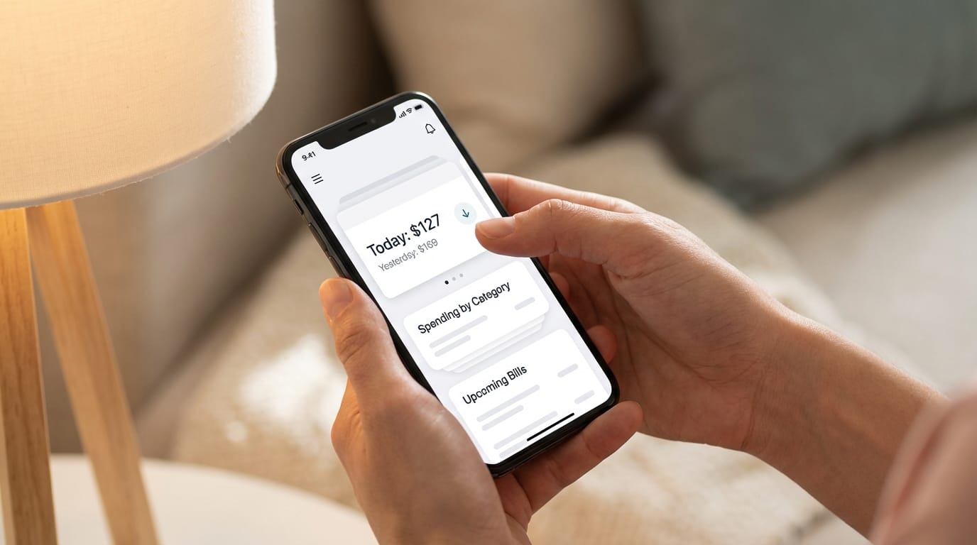
That narrowed the MVP to one core flow. Open app, see your spending categorized visually, swipe through insights, done in 30 seconds. No manual input. No complex setup. No gamification gimmicks. Just frictionless awareness.
We cut:
- Manual transaction entry
- Budget creation tools
- Goal setting features
- Investment advice
- Social features
- Anything requiring more than bank connection + one tap
Scope definition took 3 days. Most founders fight this. These ones understood: you can't raise on promises. You raise on proof.
The 3-Week Sprint: How We Actually Built It
Standard startup app development takes 3-6 months. We had 21 days. Not by cutting corners. By cutting everything that doesn't prove the hypothesis.
Week 1: Foundation
- Day 1-2: Backend architecture, database schema, bank API integration setup
- Day 3-4: Authentication flow, data sync logic
- Day 5-7: Core transaction categorization algorithm, first API endpoints
No admin panel. No analytics dashboard. No user management beyond basic auth. Those come later if the core works.
Week 2: Interface
- Day 8-10: Main feed UI, swipe interactions, visual spending cards
- Day 11-12: Settings screen, basic notifications
- Day 13-14: Polish, edge case handling, TestFlight build
We used Flutter. One codebase, iOS and Android ready. Every component built for expansion but shipped as MVP. The interface looked finished because investors judge books by covers, but the backend was strategically incomplete.
Week 3: Testing and Iteration
- Day 15: Internal testing, critical bug fixes
- Day 16-17: Beta group of 50 users, mostly friends and family
- Day 18-19: Emergency iteration on onboarding (initial version had 40% drop-off)
- Day 20-21: Final polish, App Store submission prep
The beta revealed something crucial. Users loved the feed but got stuck connecting their bank. We simplified the permission explanation screen and drop-off fell to 12%. Small change, massive impact.
By day 21, we had a live app with 50 active users and enough data to start tracking meaningful metrics.
User Testing: The Iterations That Actually Mattered
We didn't test features. We tested the core behavior: would people open the app daily without notifications?
Beta users got the app with minimal onboarding. No email campaigns. No push notifications. No re-engagement tactics. Pure organic behavior.
First week data:
- 50 users
- 32 connected their bank successfully (64%)
- 18 opened the app more than once (36%)
- 8 used it 4+ days (16%)
Not great. But enough signal to iterate.
The insight came from session recordings (Hotjar-style tracking). Users who opened the app a second time spent 2-3 minutes exploring. Users who bounced spent under 20 seconds. The difference? The multi-day users saw their spending pattern change day-to-day. Single-day users just saw a static snapshot.
Iteration: Added a "Yesterday vs Today" comparison card at the top of the feed. Simple. Two numbers. One insight: "You spent $42 less than yesterday."
Second week data (same 50 users):
- 27 active users (54% retained from successful connections)
- 14 opened 4+ days (28%)
- 5 opened 7 days straight (10%)
That 10% became the story. In two weeks, 10% of users formed a daily habit. Without notifications. Without gamification. Just because the app answered a question they cared about.
We added 30 more users. Same pattern held. The metric that mattered: 12% daily active habit formation within 14 days.
The Metrics That Impressed Investors
The pitch deck before the MVP: assumptions and market size charts.
The pitch deck after: real user behavior.
Here's what actually moved the needle in investor conversations:
12% DAU formation rate — In consumer apps, getting users to return daily is brutal. Instagram took years to optimize to this. The founders had it in week two of beta.
64% bank connection rate — Most fintech apps see 30-40% completion on bank linking. The streamlined onboarding proved users trusted the product immediately.
2.3-minute average session — Not time-wasting scrolling. Focused engagement. Users came, checked their insight, left. Exactly the behavior the product promised.
Week-over-week growth without paid acquisition — The 80-user beta was all organic. Users invited friends. Not viral, but proof of word-of-mouth potential.
Zero churn in power users — All 10 users who hit 7-day streaks were still active 30 days later. Small number, but 100% retention in the target behavior.
Investors don't fund features. They fund proven user behavior that suggests a viable business model. The MVP gave them numbers that told a story: people will use this daily, trust it with their data, and tell others about it.
One VC literally said: "You've de-risked the biggest question we have about fintech apps. Will people actually engage?"
Post-Funding: How They're Scaling Without Breaking What Worked
Series A closed in February. They didn't immediately 10x the team and rebuild everything. Smart move.
The scaling strategy:
Months 1-2: Grow beta to 1,000 users. Same core product. Validate metrics hold at scale. They did. 11% DAU formation. 61% bank connection rate. Close enough.
Month 3: Hire two engineers. Add the second-most-requested feature (spending limits with soft nudges). One feature. Ship fast. Measure impact.
Month 4: Public launch. App Store and Google Play. Modest paid acquisition ($10K test budget). CAC came in at $8 with 14-day LTV at $2. Not profitable yet, but in the ballpark for seed metrics.
Month 5-6: Build the features they cut from MVP. Goals, budgets, advanced insights. But now informed by 2,000+ users worth of behavior data.
The rapid MVP approach didn't just get them funded. It gave them a foundation of real user feedback to build on. They're not guessing what to build next. They're listening to how people actually use the product.
At Etere Studio, we've seen this pattern repeatedly. The startups that raise fastest aren't the ones with the most features. They're the ones who prove a core behavior works, get it in users' hands, and show up to investor meetings with data instead of promises.
Three weeks isn't magic. It's prioritization. It's understanding that startup app development is about learning speed, not feature count. Build the smallest thing that proves your hypothesis. Get real users. Let the data do the talking.
Want to explore a similar approach for your startup? We run 3-week MVP sprints designed specifically for pre-seed and seed-stage founders. Book a discovery call and let's talk about what your version of this could look like.